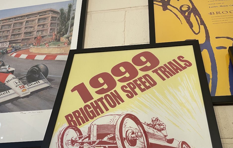
Creating a visually appealing poster is a blend of art and science. Whether it's for an event, a product launch, or an academic presentation, a well-designed poster can grab attention and convey your message effectively. Here’s a comprehensive guide on how to create a beautiful and effective poster.
Understanding the Purpose
The first step in designing a poster is understanding its purpose. Ask yourself what message you want to convey and to whom. Is it to inform, persuade, or entertain? Identifying the goal will help you decide on the content, design elements, and tone of the poster.
Research and Inspiration
Before you start designing, research similar posters to get an idea of what works and what doesn’t. Look for inspiration on platforms like Pinterest, Behance, or design blogs. Note the use of colors, typography, and layout. This research phase is crucial for understanding current design trends and finding elements that resonate with your audience.
Choosing the Right Dimensions
The size of your poster depends on where it will be displayed. Common sizes include A2 (420 x 594 mm), A3 (297 x 420 mm), and A4 (210 x 297 mm). Larger posters, like A0 (841 x 1189 mm), are often used for events or exhibitions. Ensure the dimensions are appropriate for the viewing distance and the amount of information you plan to include.
Creating a Strong Visual Hierarchy
Visual hierarchy is the arrangement of elements in a way that directs the viewer's attention. The most important information should stand out the most. Use size, color, and placement to create a clear hierarchy. The title should be the largest element, followed by key details like date, time, and location. Supporting information should be smaller but still legible.

Selecting a Color Scheme
Color plays a significant role in the overall aesthetics of your poster. Choose a color scheme that aligns with the message and tone of your poster. For a vibrant and energetic look, use bold and bright colors. For a more professional and serious tone, opt for muted and neutral colors. Tools like Adobe Color can help you create harmonious color palettes.
Typography Matters
Typography is a crucial element in poster design. Choose fonts that are easy to read from a distance and complement the overall design. Use no more than two or three different fonts to maintain a cohesive look. The title should be in a bold, attention-grabbing font, while the body text should be clean and legible. Consider using different weights and styles of the same font family for variety.
Incorporating Visual Elements
Images, illustrations, and icons can enhance the visual appeal of your poster and help convey your message. Ensure that any visual elements you use are high quality and relevant to the content. Avoid cluttering the poster with too many images; instead, use them strategically to highlight key points.
Balancing the Layout
A well-balanced layout is essential for an aesthetically pleasing poster. Use grids to organize your elements and ensure they are evenly spaced. Symmetry can create a formal and professional look, while asymmetry can add interest and dynamism. Whitespace is also important; it helps to avoid a cluttered appearance and makes the content easier to read.
Adding a Call to Action
If your poster is intended to prompt a response, include a clear call to action (CTA). This could be an invitation to attend an event, visit a website, or contact for more information. Make the CTA prominent and easy to follow. Use action-oriented language and consider adding visual cues like arrows or buttons.
Reviewing and Refining
Once you’ve completed your design, take the time to review and refine it. Check for any spelling or grammatical errors. Ensure that all elements are aligned and that the color scheme is consistent. It can be helpful to get feedback from others; they might notice things you’ve overlooked. Make any necessary adjustments to improve the overall look and effectiveness of your poster.
Using Design Software
There are several design software options available that can help you create a professional-looking poster. Adobe Illustrator and Photoshop are industry standards, offering a wide range of tools and features. For those looking for a more user-friendly option, Canva provides templates and an intuitive interface. Whichever software you choose, take the time to learn its features to make the most of your design.

Printing Considerations
When your design is complete, it’s time to print your poster. Choose a high-quality printer and appropriate paper stock. Glossy paper can make colors pop, while matte paper reduces glare and is easier to read. Ensure that the print resolution is high enough to maintain clarity and detail. If possible, request a proof before printing the entire run to check for any issues.
Promoting Your Poster
After printing, consider how and where you will distribute your poster. High-traffic areas like community boards, schools, and coffee shops are ideal for maximum visibility. Utilize social media to share a digital version of your poster and reach a wider audience. The goal is to ensure that your poster is seen by as many people as possible.
Conclusion
Creating a pretty poster involves careful planning, creativity, and attention to detail. By understanding the purpose, researching for inspiration, choosing the right dimensions, and following design principles, you can create a poster that not only looks good but effectively communicates your message. Whether you’re a seasoned designer or a beginner, these tips will help you create a poster that stands out and achieves its goal.


